Monthly Climate Science and Energy Engineering Dinner
NYC Monthly Climate Dinner -- csaee_d
 |
|
Purpose We meet monthly for dinner on the second Monday of the month to discuss climate science and zero-carbon energy engineering. We feel that you can't be of much use as an environmentalist unless you are technically well-informed. Environmental problems are scientific problems, and how to solve them is an engineering question. If you are not technically well-informed, you will make inaccurate statements about science that are an embarrassment to the environmental movement, and the solutions you advocate will be ill-advised and/or counter-productive. So the purpose of these dinners is to create a space for informative discussion of climate science and zero-carbon energy engineering. Environmentalists who are scientifically poorly-informed have an infamous track record of making predictions (often dire) that do not materialize as scheduled, and advocating solutions that are poor engineering choices. |
|
We will meet on the second Monday of every month from 7:00 pm to 9:00 pm at the Skylight Diner see (map) at the southwest corner of 9th Avenue and West 34th Street in Midtown Manhattan, within easy reach of the A/C/E & 7 subways, and a block away from LIRR and NJ Transit at Penn Station. The restaurant has a large menu with many cuisines and does separate checks for large groups, so everyone can pay with their own credit card.
|
|
|
|
This Month's Topic: "The Pause" in Satellite Temperature Data Around 2010, the Earth's warming as measured by
satellite data seemed to have stopped. Climate
skeptics had a field day talking about "the pause"
in warming. Here is a plot I made from the satellite data
downloaded from the University of Alabama at
Huntsville website: 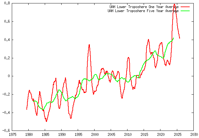 UAH Lower Troposphere Satellite Temperature Data The raw data was monthly, the red line is the monthly data averaged over a year, and the green line is monthly data averaged over 5 years, which is the most interesting as it makes it easier to observe long-term trends, which is what we are interested in. As one can observe, looking at the green line, that warming seems to have stopped from about 1998 to 2014, after which warming returned with a vengeance. For years, climate skeptics kept saying "warming has stopped" because they weren't checking the latest data, and many of them are less than honest. The climate skeptic Roy Spencer is at the
University of Alabama at Huntsville, and he makes
this chart available on his website. 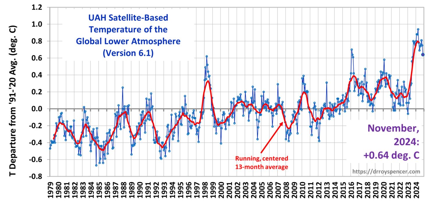 It's the same data, but he does tricks to minimize
the amount of warming that is apparent. To
begin with, he compresses the Y-axis relative to the
X-axis for no appartent reason. He never plots
5-year data. His red line and my red line go
up and down at the same time because they're both
plotting the same thing. He plots all these
blue points that came from heaven-knows-where, it's
probably monthly data which is seasonal,
meaningless, and completely useless except to drown
the signal in noise. To do a better job of drowning out the signal in noise, Spencer would have had to outright fabricate data, which I don't believe he did. The first time I saw Spencer's plot I didn't have
my own plots of the satellite data. A climate
skeptic was showing me Spencer's plot in about 2021
and telling me with a straight face that the plot
showed "no warming". I didn't agree -- I felt it
showed warming, and that was what motivated me to do
my own, more objective, plots, minimizing the noise
and maximizing the signal. Interestingly, "the pause" didn't show up on
surface temperature measurements. NOAA
provides plots: 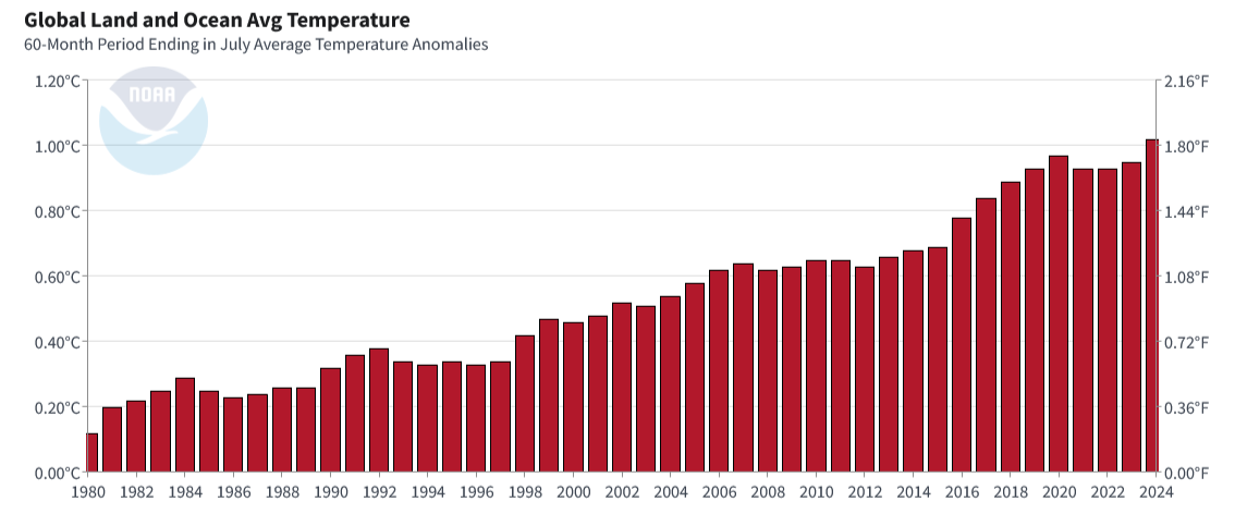 This is plotting a 5 year average of the
data. There's still "the pause", but now it's
only from about 2008 to 2014 rather than 1998 to
2014. Some climate scientists argue that the reason for
"the pause" in satellite temperature data was that
the satellite was decaying in it's orbit, and here
is a plot I made from data that had that decay
adjusted for: 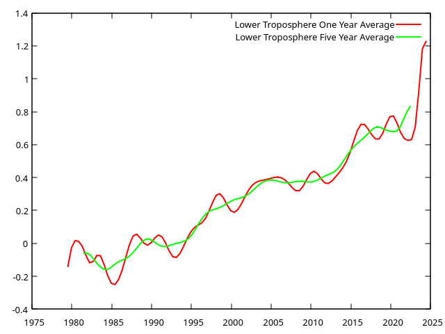 "The pause" is still there, but much less evident. No matter whose plot one uses, whatever "pause"
ever existed ended over a decade ago. |
Supporting Organizations (Thus Far)
|
| Organizer: Bill Chapman Cell: 212-810-0470 Email |